Color
Primary PALETTE
Color Usage
The less color you use in your designs, the more the colors will pop when you do use them, this is especially true with our vibrant color scheme, too much of the red and orange can be overwhelming.
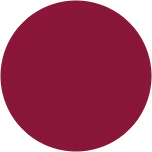
Use the darkest shade of maroon #5d0b30 when using the color as large background, use the brighter shade of red #871a39 for uses such as buttons, icons and type where it’s not large.


