
Logo
The Chabad logo is bold yet simple, with an iconic angular menorah form that shows the warmth and light that Chabad brings to everyone they reach.
This work is licensed under a Creative Commons Attribution 4.0 International License. Meaning it's free to: Share — copy and redistribute the material in any medium or format, and Adapt — remix, transform, and build upon the material for any purpose, even commercially.
Please use the following guidelines as a reference when using the Chabad logo.
Generate custom Logo → | Download generic Logo →
Vertical
The vertical logo has the icon on top of the Chabad wordmark and is perfect to use when the logo will be centered on the design.

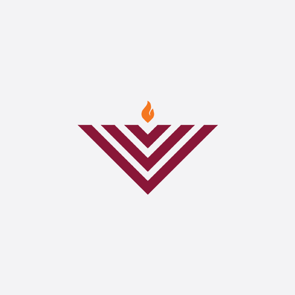
Primary Color logo on White Background

Inverted Color

White on Image Background

Solid Black
The logo is designed to be simple and work on multiple backgrounds, there are 4 colors of the logo to allow it to work optimally in different contexts.
Primary logo
Full color logo which goes on any white background such as Stationary or the back of a postcard neer the address.
Inverted Color
This inverts the logo to make the Maroon into white to allow the logo to be placed on a Maroon background, this is perfect for heavily branded items like Kippas, Brochure covers and Signage.
Solid White
It is easy to use on all types of background including images and dark non- branded-colors.
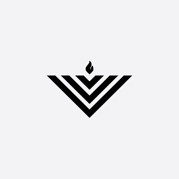
Solid black
For use when printing in black and white, this makes the colors even so that the flame does not wash out.
Horizontal
The horizontal logo has the Icon to the left of the Chabad wordmark and should be used when the logo is on the sides and corners of a design (Example: Logo in this website's menu.)

Primary Logo on White Background

Inverted Color

White on Image Background

Solid Black
Symbol
The symbol can be used on it's own when you need to be more minimal with your branding such as on the bottom of a social post or when there is already mention of the chabad name elsewhere (Example: "Chabad Main St invites you to...")


Clear space
The Chabad logo should always be surrounded by a minimum area of space. The area of isolation ensures that headlines, text or other visual elements do not encroach on the logo.
The area is defined by doubling the height of the flame from the Chabad symbol. A margin of clear space equivalent to this height is drawn around the logo to create the invisible boundary of the area of isolation.

This area of separation is a minimum and should be increased wherever possible.
Improper Use
Using the logo in it's intended use helps maintain consistency across all uses which leads to higher brand recognition.
Do not change the color of the logo.
Do not apply graphic effects to the logo such as drop shadows and gradations.
Do not distort, stretch or scale the height or width of the logo disproportionately.
Do not use the design on similarly colored backgrounds.
Do not add graphical elements on the logo.


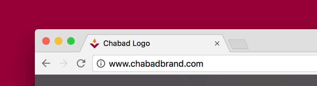
Favicon
Lockups
Multiple Chabad Centers
When two or more Chabad centers are partnering on a project you should only use the logo once with multiple locations underneath, if there are more than 3 centers, the locations should no longer be attached to the logo but rather get it's own space on the marketing material.

Partnerships
When partnering with other organizations, it's important that the Chabad logo is at minimum visually equal to the partnering logos.
For optimum legibility, this is a good time to use the horizontal logo.
